Reducing Hospital Queues With ABDM Integrated OPD Booking
Overview
OPD registration at government hospitals is slow: patients refill the same forms every visit and wait for hours. I designed an ABHA compliant booking flow to fix that.
My role
Solo UI/UX designer: research, visual design, prototyping, handoff
Team
With the CEO and 2 developers at N6T Technologies
Timeline
4 weeks, 2025
Impact overview
Hospital pilot
The first version won a ₹12K pilot at CWS Hospital.
Registrations
5K+ registrations so far.
Speed
From research to developer handoff in 4 weeks.
Summary
This case study shows how I turned a brand new government health
standard into a booking flow patients can finish on their own phone.
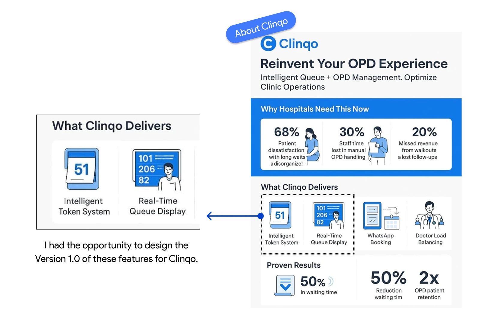
Clinqo, built by N6T Technologies, is a hospital management system for tier 1 and tier 2
cities like Bhubaneswar and Rourkela.
I designed V1 of its patient appointment flow, which lets people book an OPD slot with
or without an ABHA ID.
I had 4 weeks. The prototype helped Clinqo win its first pilot, a ₹12,000
contract with CWS Hospital.
The Problem We Are Solving
OPD registration at government hospitals is
slow and manual. Patients fill the same forms on every visit, stand in line at the counter,
and then wait for hours without knowing when their turn will come.
Clinqo needed an ABDM integrated
flow that speeds up registration and cuts the wait.
ABDM & ABHA in 30 Seconds
The biggest challenge was time. Clinqo
wanted to pitch this feature to CWS Hospital within 4 weeks, and I first had to learn
how the whole system works.
Quick context:
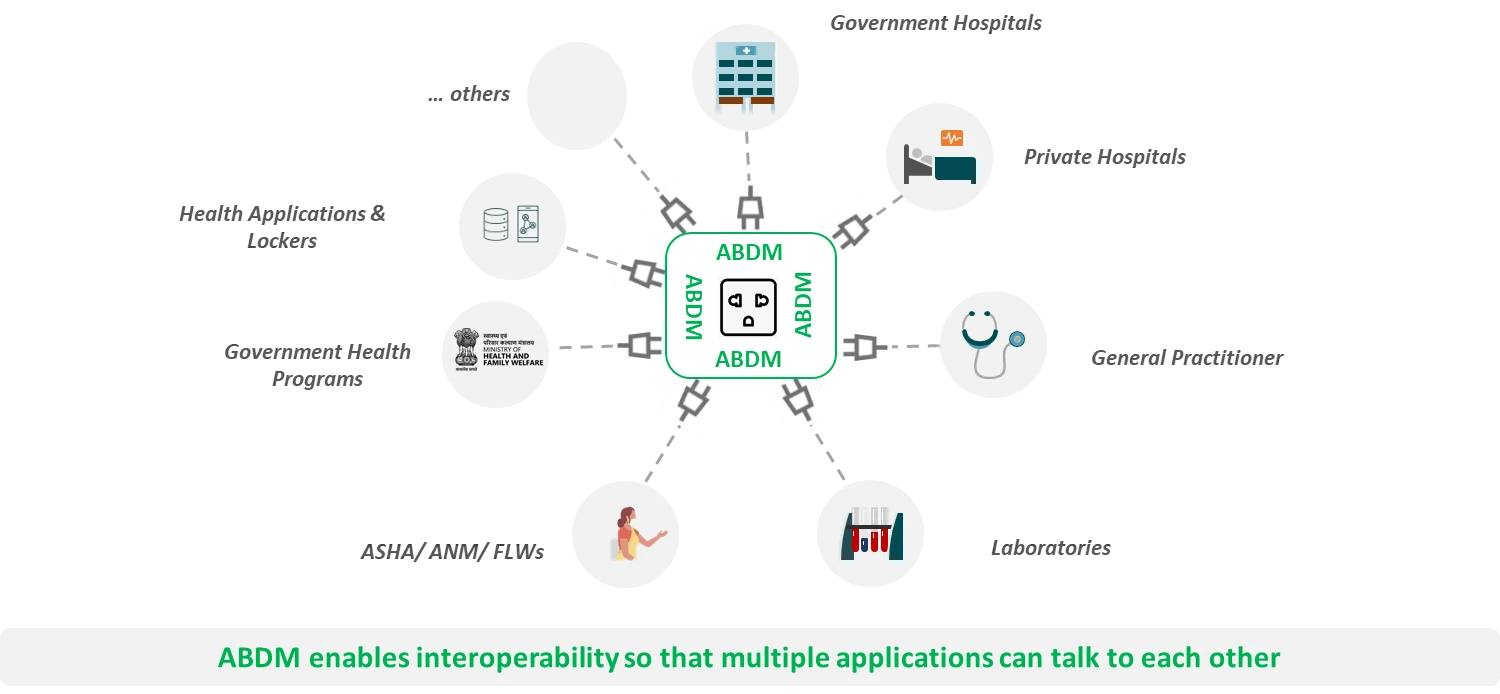
ABDM (Ayushman Bharat Digital Mission) is India's digital health
mission. It connects patients, hospitals and doctors so records move securely.
ABHA (Ayushman Bharat Health Account) is a 14 digit health ID.
Think of it as a digital Aadhaar for your health records, shared only with your
consent.
How I Researched in a Tight Window
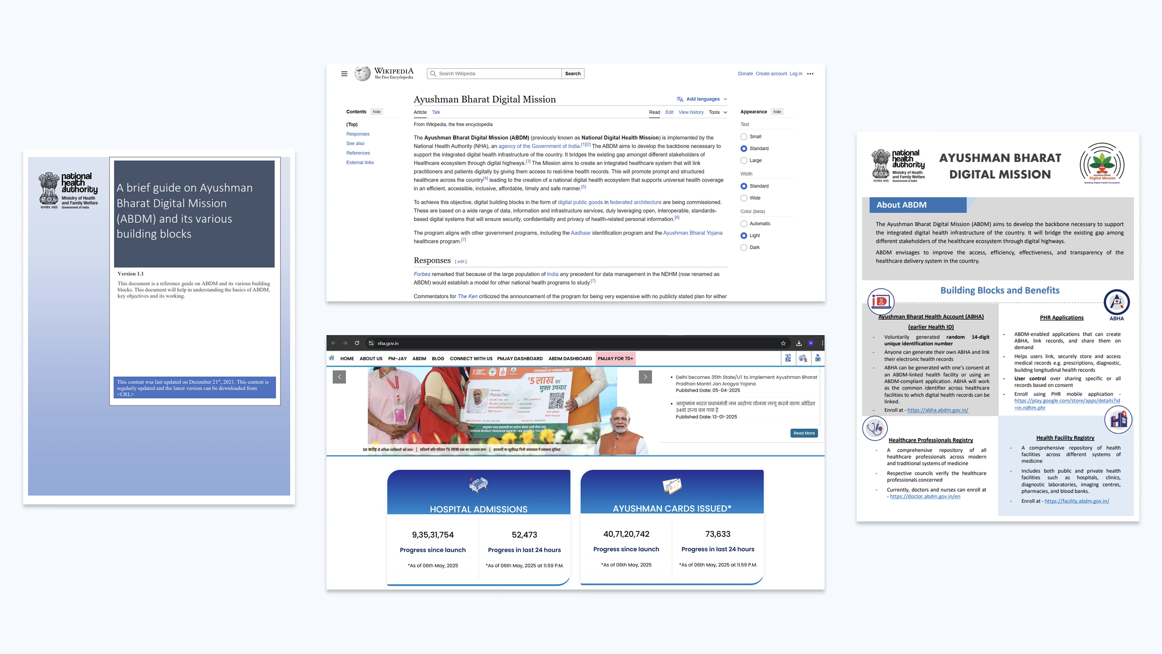
I started with secondary research: the National Health Authority's ABDM
guide, research papers, and articles on how hospital appointments work today.
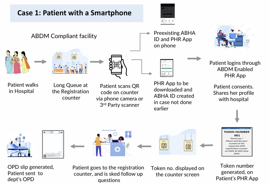
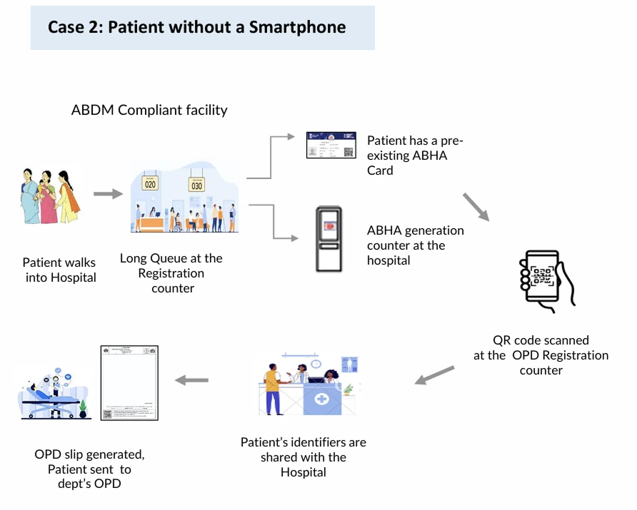
This let me map the patient journey after ABHA
rollout, for patients with and without a smartphone. It also showed exactly where my
design fits: the moment a smartphone user scans a QR and books.
Patient with a smartphonePatient without a smartphone
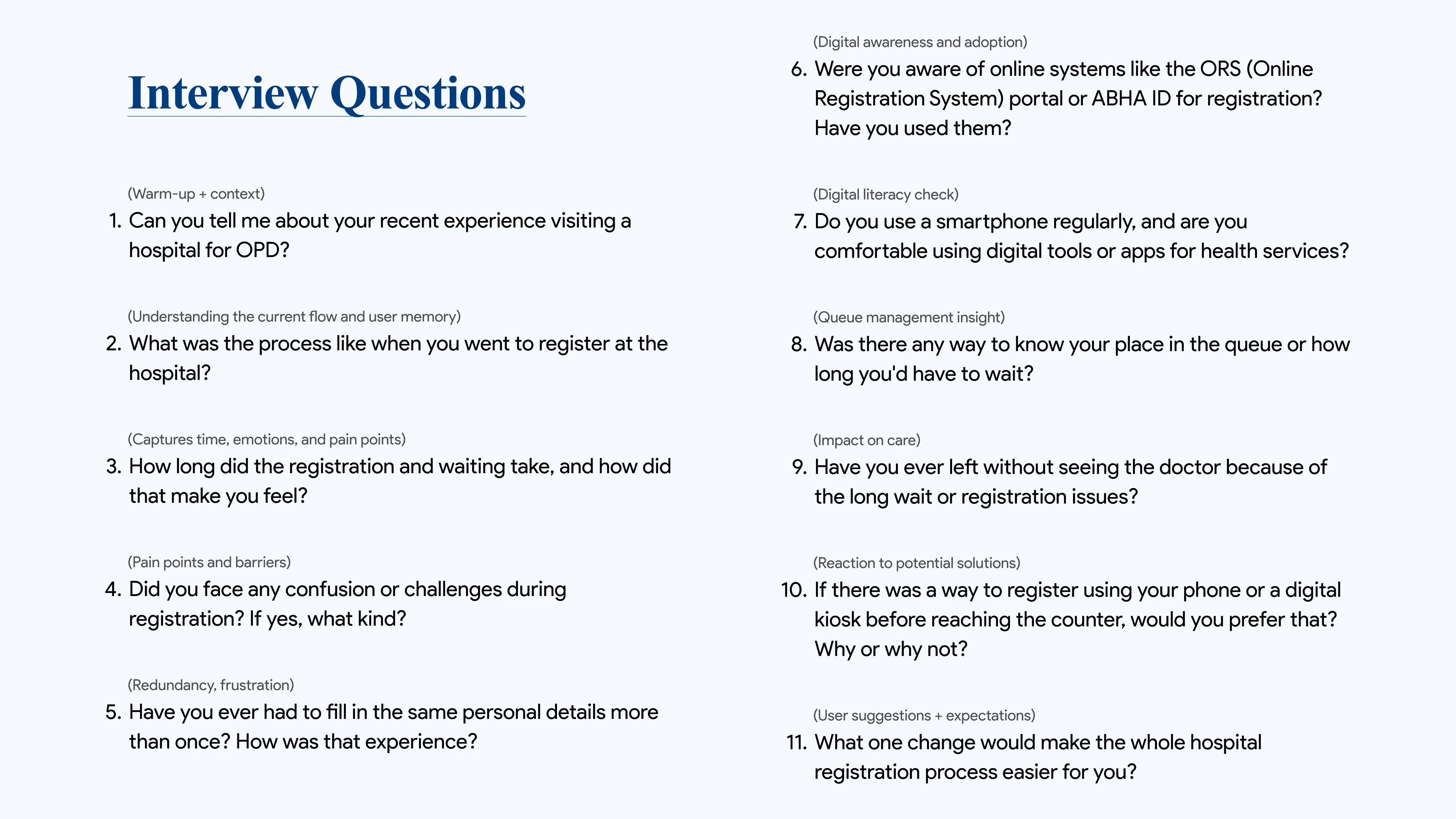
Then I ran semi structured interviews with 2
people who had visited hospitals the most in the last quarter, to check my assumptions against
their own experiences instead of my own bias.
What the Research Told Me
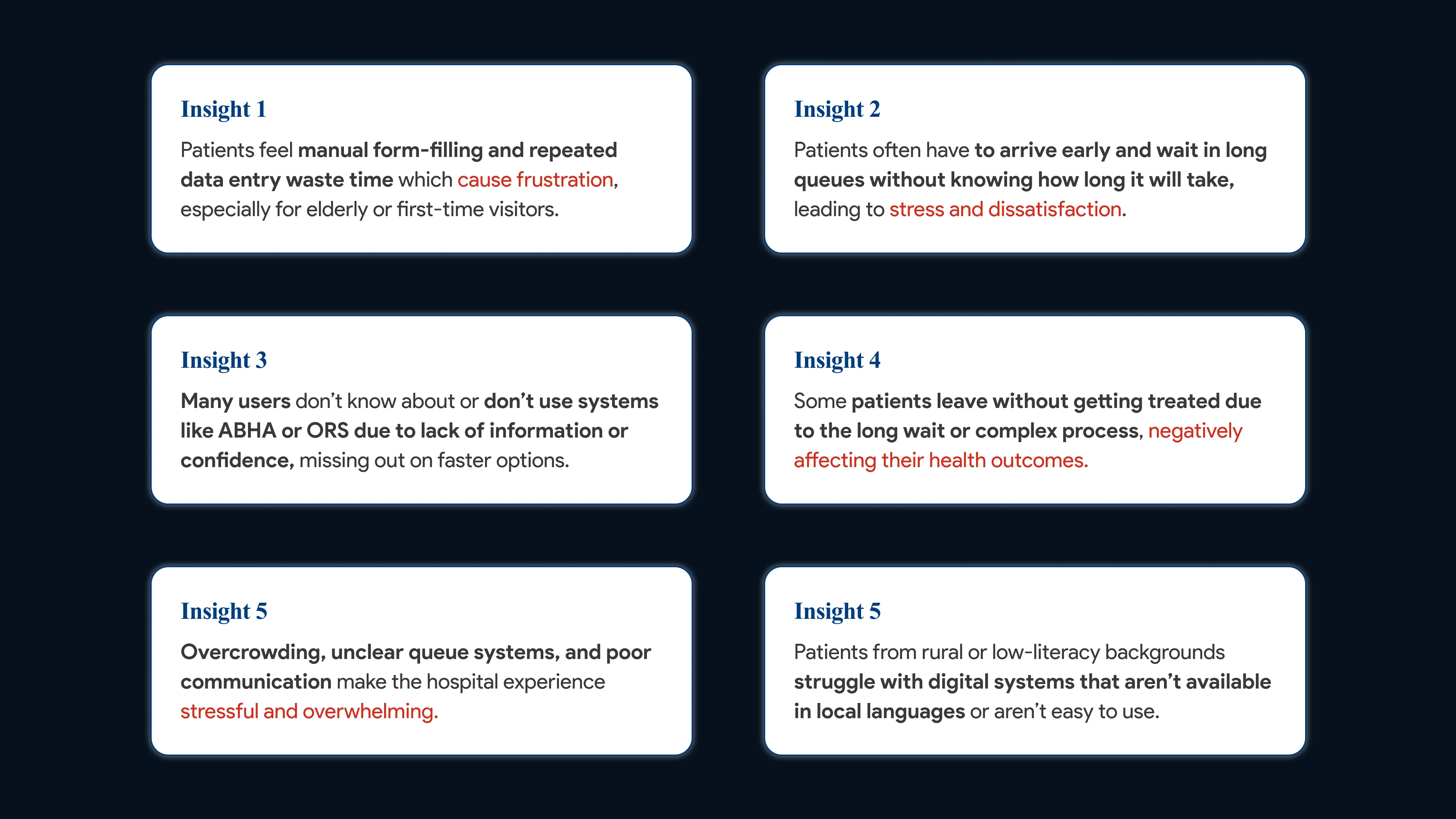
Secondary research gave me 6 assumptions. The interviews
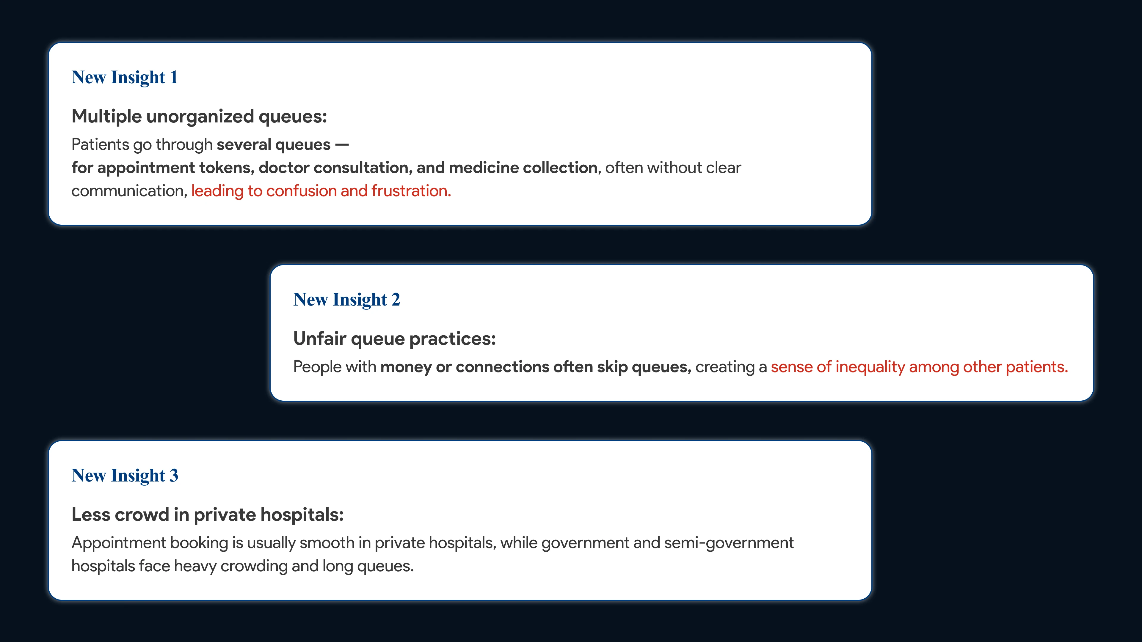
confirmed most of them and surfaced 3 new ones.
Patients stand in several unorganized queues: tokens,
consultation and medicine.
No one knows how long the wait is, so people arrive early and some leave
untreated.
People with money or connections skip the line, which feels
unfair.
Many patients have never used ABHA, so they miss the faster option.
The Pain Points I Chose to Solve
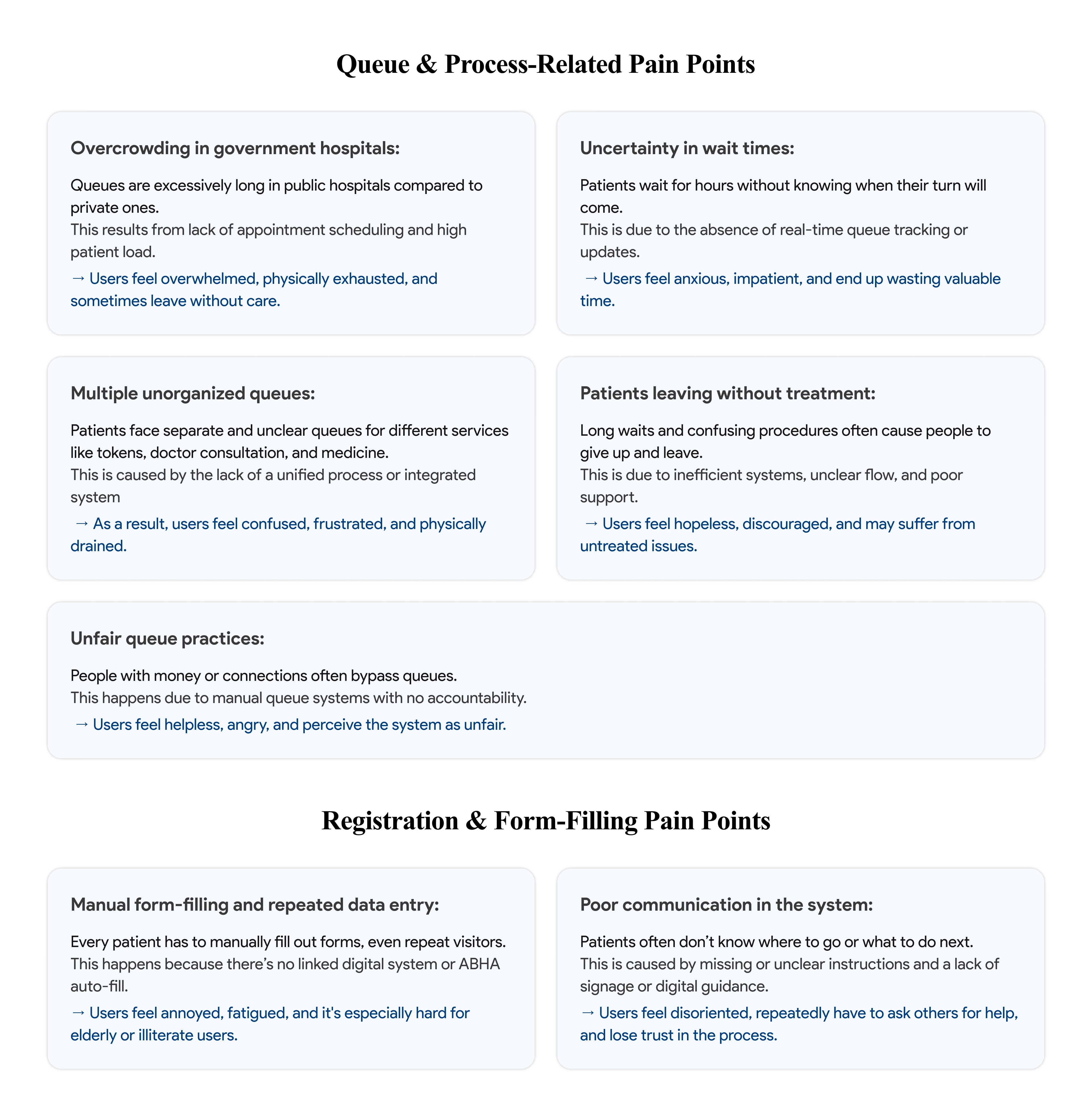
With 4 weeks, I focused on two buckets V1 could actually move:
queue and process problems, and registration and form filling
problems.
Who I Designed For (and Who I Didn't)
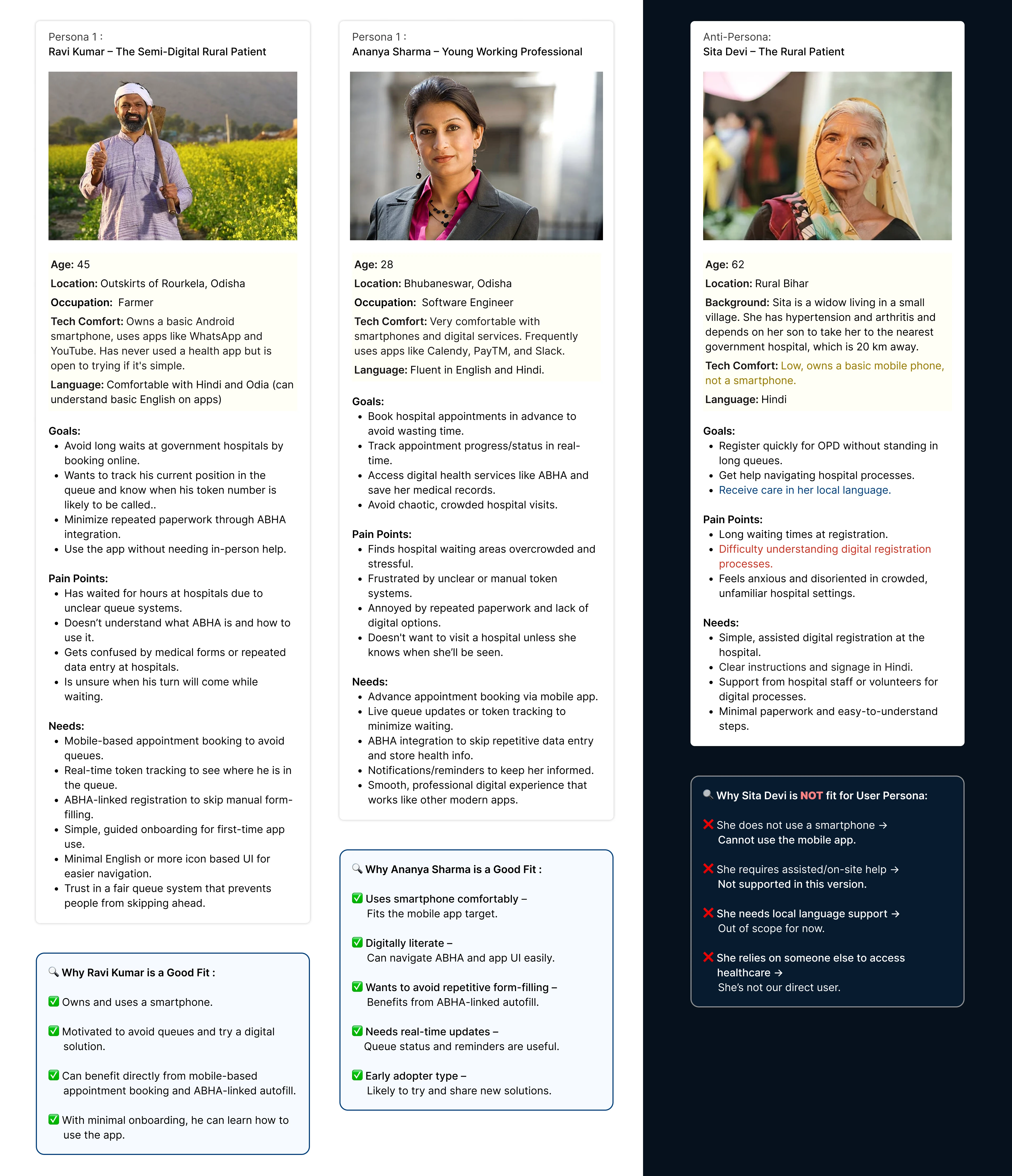
Two smartphone users made the cut: Ravi, a semi digital farmer
near Rourkela, and Ananya, a working professional in Bhubaneswar.
Sita Devi, a 62 year old rural patient without a smartphone,
became my anti persona. She needs assisted, local language support, which was out of
scope for V1. Saying no early kept the prototype focused.
Turning Pain Points Into Goals
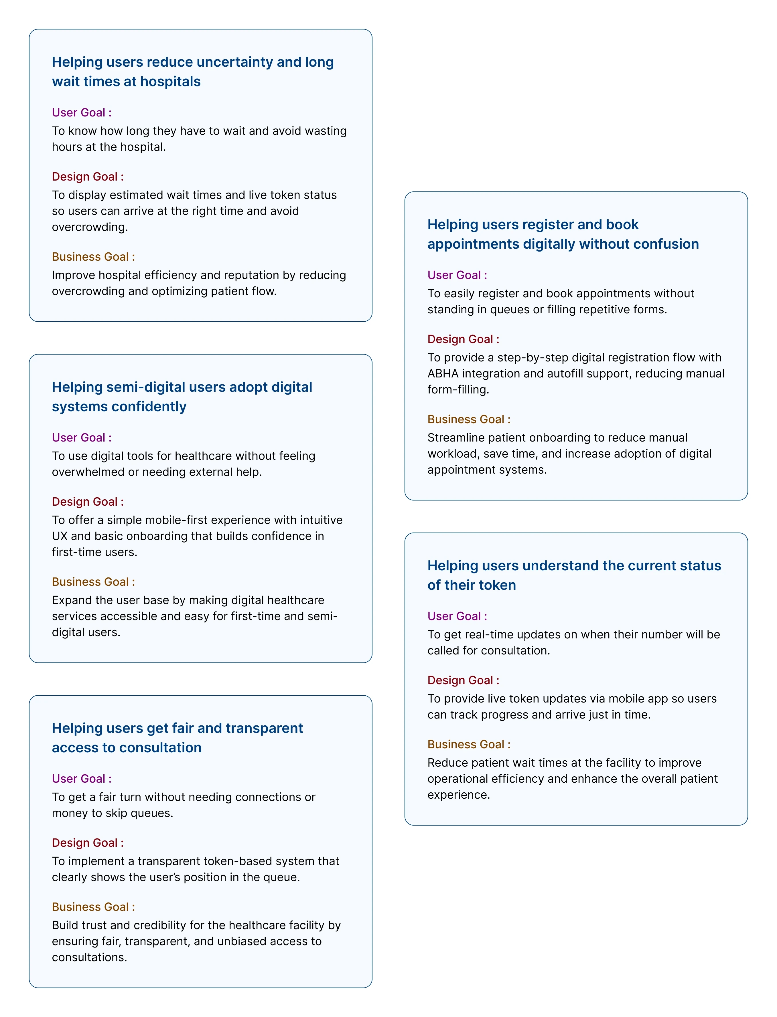
For every problem, I paired a user goal with a design goal and a
business goal, so each screen had a clear reason to exist.
The five goals: cut uncertainty and wait
time, make registration painless, build confidence for first time users, show live token
status, and keep the queue fair.
Mapping the Flow
The system was new to me, and I got stuck on
the user flows. The CEO suggested studying similar products, and that competitive analysis
gave me a realistic direction.
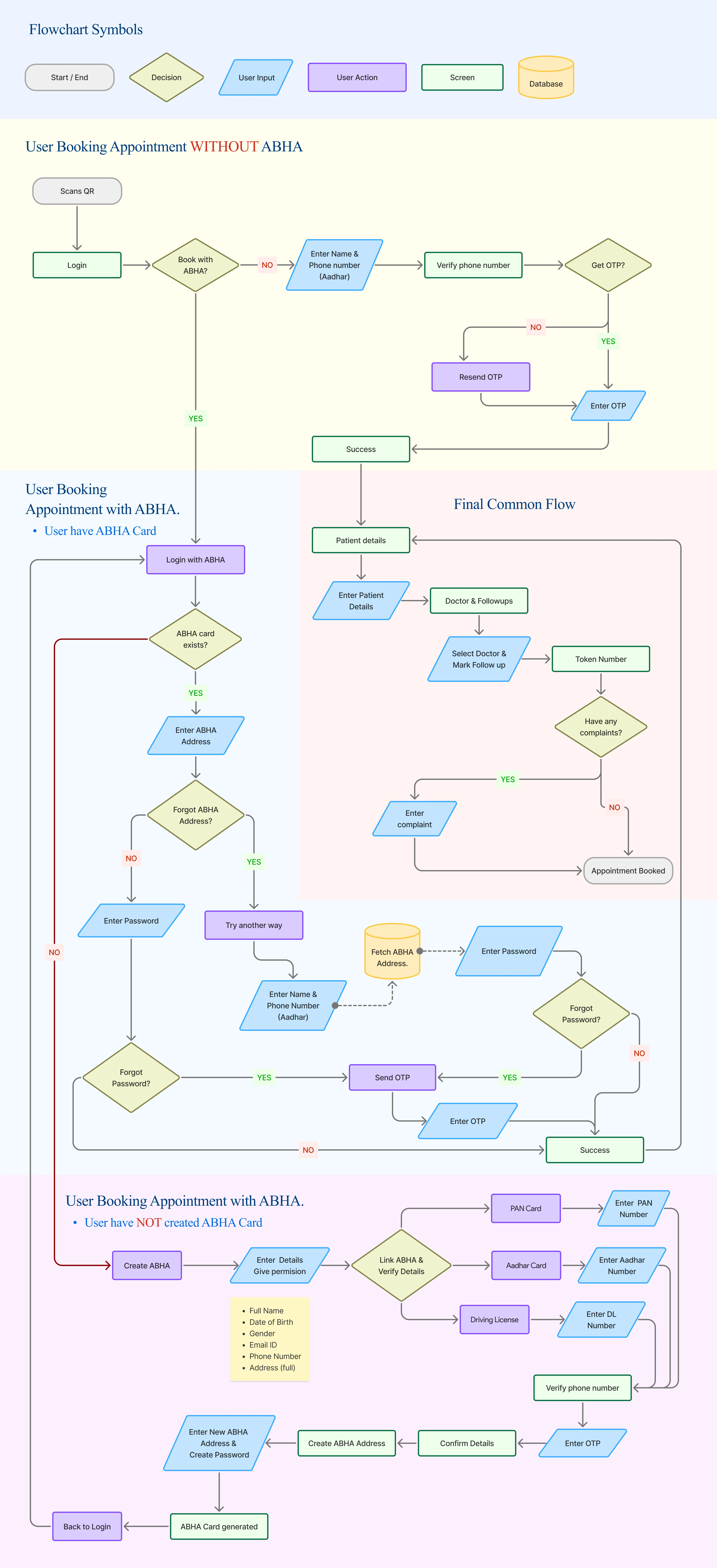
After many iterations, the final flow has three paths that merge
into one: booking without ABHA, logging in with ABHA, and creating a new ABHA on
the spot.
From Paper to a Mini Design System
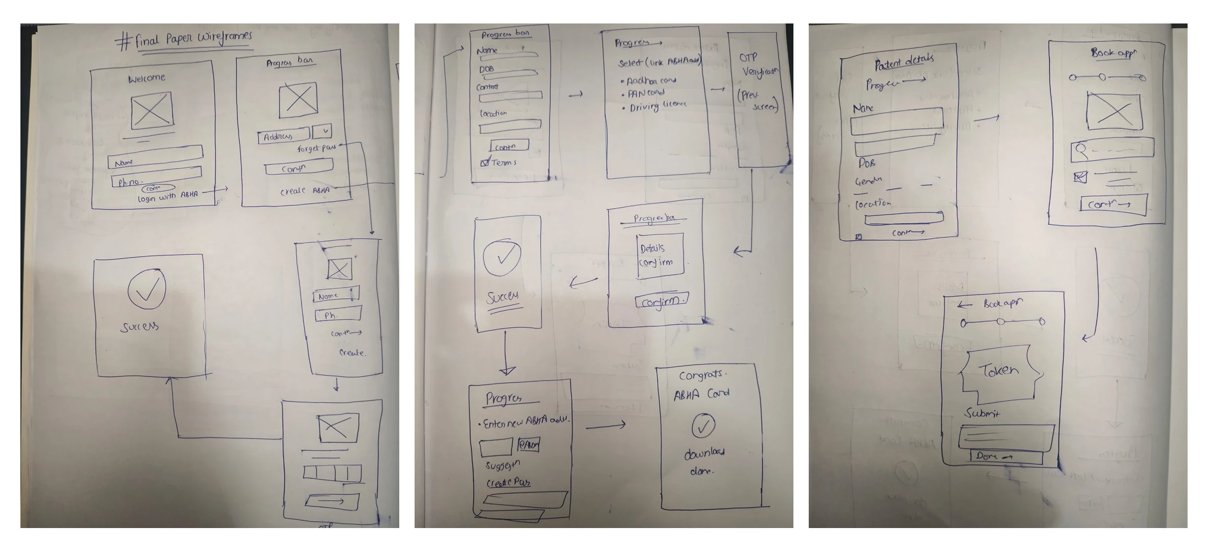
I sketched every screen on paper first, then moved straight to high
fidelity in Figma and kept iterating on feedback.
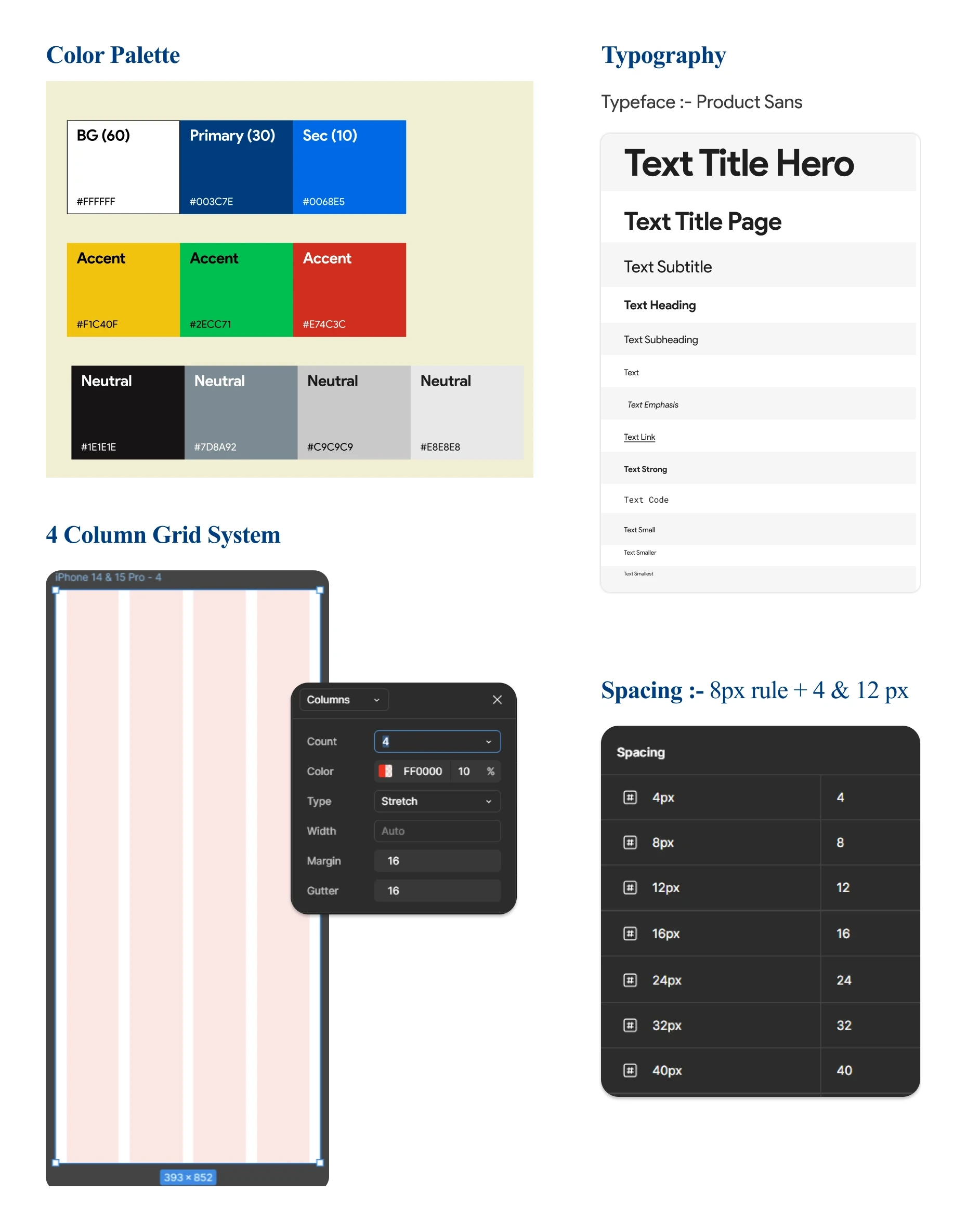
Clinqo had no design system, so I built one from scratch.
A blue primary palette, as the company asked
Product Sans type scale
4 column mobile grid and an 8px spacing rule
Components with every state: default, hover, pressed, loading, disabled and
error
Final Designs
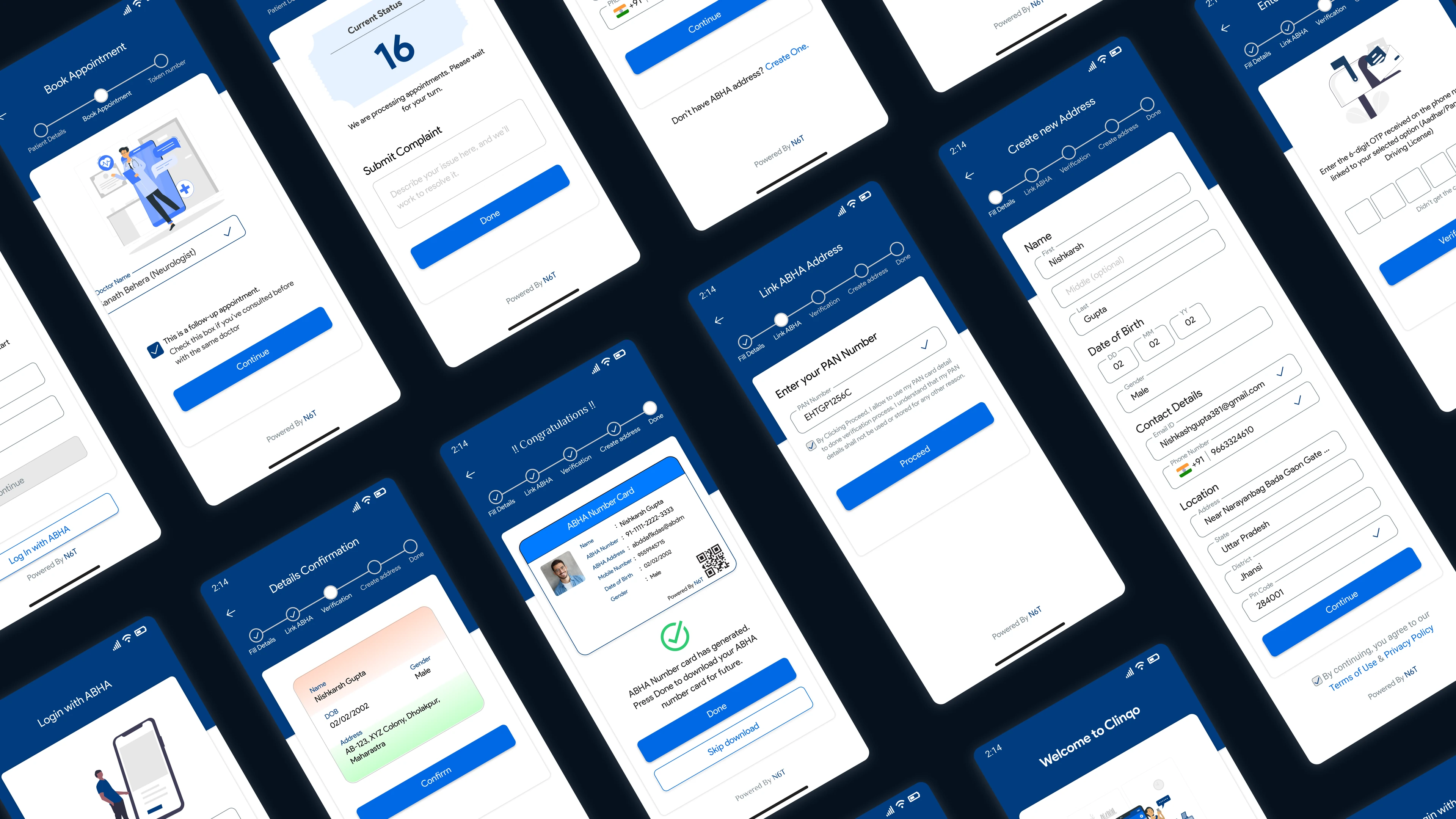
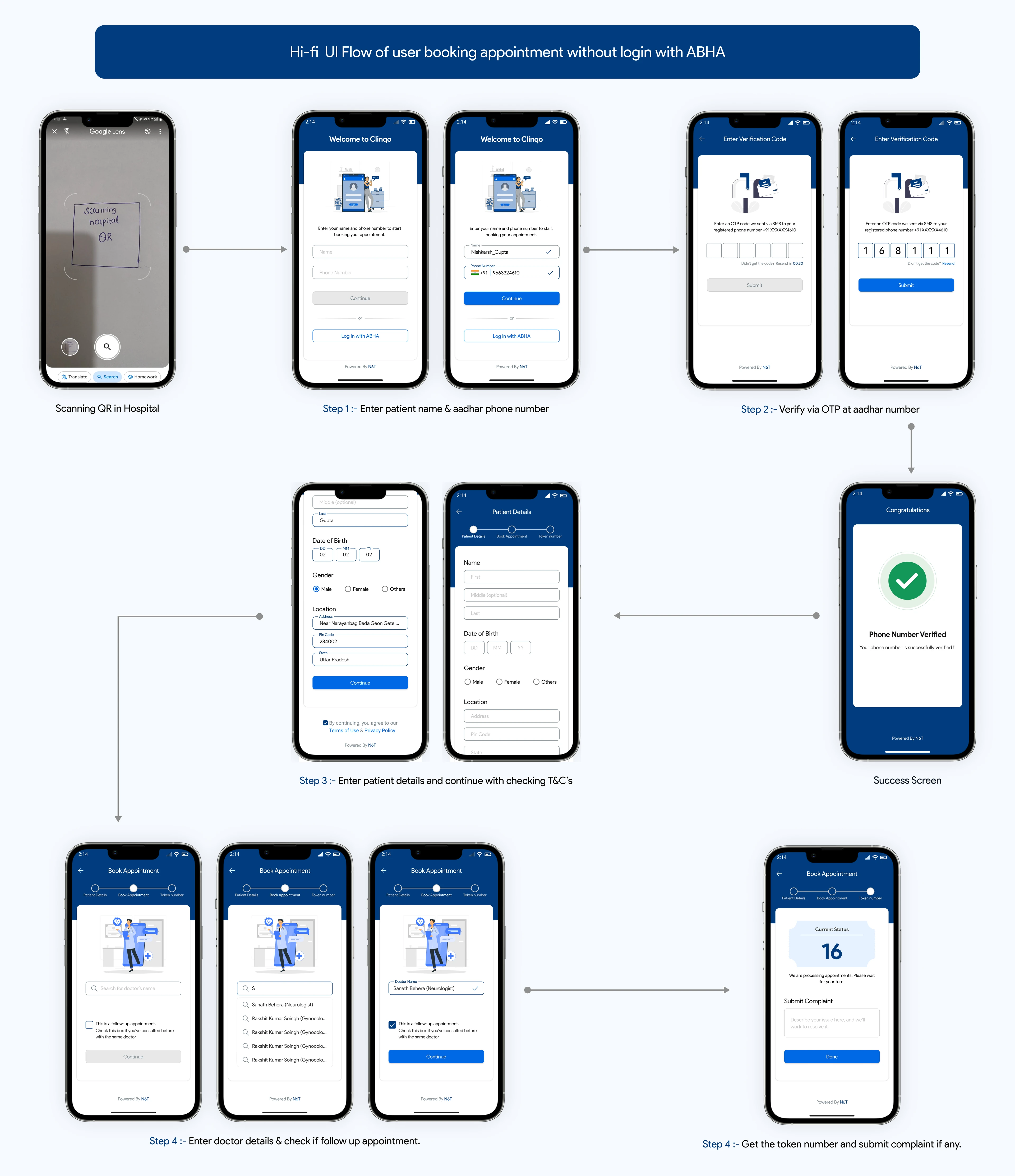
A patient scans the QR at the hospital, verifies with an OTP, fills
details once, picks a doctor and gets a live token number. No counter line, no
repeated forms.
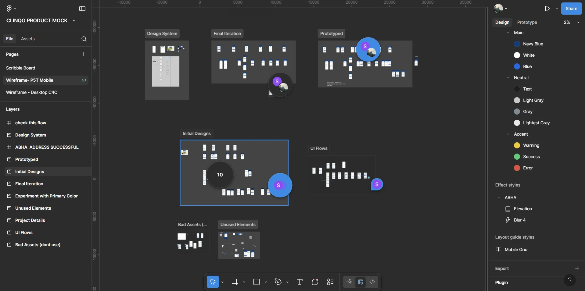
Try the interactive Figma prototype
Behind the scenes of the Figma file
Impact
V1 gave Clinqo a working flow to pitch, and it landed the first pilot at
CWS Hospital.
₹12KPilot contract from CWS Hospital
5K+Registrations till now
₹5LTide grant from Chitkara
What I Learned in 4 Weeks
Learning a new domain fast is part of the job. Primary sources like the NHA guide beat
blog posts.
Asking for help early saves days. One tip from the CEO turned into the competitive
analysis that unblocked the flow.
An anti persona is as useful as a persona. It tells you what not to build in V1.
Further reading
Want every detail? The long version lives on Medium.