Bitcoin Keeper is a multisig wallet with inheritance planning, and it only had a mobile app. I researched why desktop was worth building, then designed its onboarding.
My role
UX research and product design
Team
With the Bitcoin Keeper team at BitHyve
Timeline
June 2025, Summer of Bitcoin
Impact overview
Case for desktop
Showed why desktop was worth building, for users and for revenue.
Research
Compared 5 wallets and walked through 4 onboarding flows screen by screen.
Design
A lean mobile to desktop onboarding plus the UI foundation.
Summary
This case study shows how I researched why a Bitcoin wallet needed
a desktop app, then designed the first thing every user sees: onboarding.
Bitcoin Keeper, built by BitHyve, is a non custodial multisig wallet with inheritance
planning. It already had a mobile app.
During Summer of Bitcoin 2025, I researched the case for a desktop app and designed its
onboarding and UI foundation.
The challenge: one flow that works for first time holders and Sparrow power
users alike, without jargon.
The Problem We Are Solving
People holding 1 BTC or more want a desktop
wallet that is advanced and secure, yet still easy to use for multisig, hardware wallets and
inheritance.
Tools like Sparrow and Specter are powerful
but built for experts. They lack collaborative key management, inheritance flows, remote signing
and mobile to desktop sync.
Keeper Desktop had to bridge that gap
without taking away user control or privacy.
Why Build a Desktop App at All?
Keeper already had a mobile app. Before
designing anything, I had to show that desktop was worth building, for users and for
the business.
What I found:
Security first users trust desktops more. Hardware wallets like
Coldcard, Trezor and Ledger plug straight in over USB.
A bigger screen lowers risk in high stakes flows like reviewing
transactions or assigning heirs.
Desktop plus mobile means redundancy. Lose your phone, keep your
vault.
It opens revenue: premium plans for power users, hardware wallet
partnerships, Keeper Private for high net worth users, and better retention across
devices.
How Other Wallets Compare
I compared Keeper with four popular wallets, then walked through the
onboarding of Sparrow, Wasabi, Nunchuk and Liana screen by screen.
Bitcoin Keeper
BlueWallet
Wasabi
Nunchuk
Sparrow
Multisig
✓ UX first
Limited
✕
✓ Advanced
✓ Very advanced
Inheritance
✓ Built in templates
✕
✕
Manual
Manual, technical
Shared custody
✓ Contacts & roles
✕
✕
✓ Needs coordination
✓ Manual setup
Beginner friendly
✓
✓ Basic
✕
Learning curve
✕ Experts only
Built for
Everyday users & families
Everyday users
Privacy maximalists
Power users & teams
Technical users
What their onboarding taught me:
No one personalizes onboarding. Everyone gets the same flow, whatever
their experience.
Jargon everywhere. Terms like xpub and cosigner hit users on screen
one.
No one talks about mobile sync. A clear opening for Keeper, whose users
mostly start on mobile.
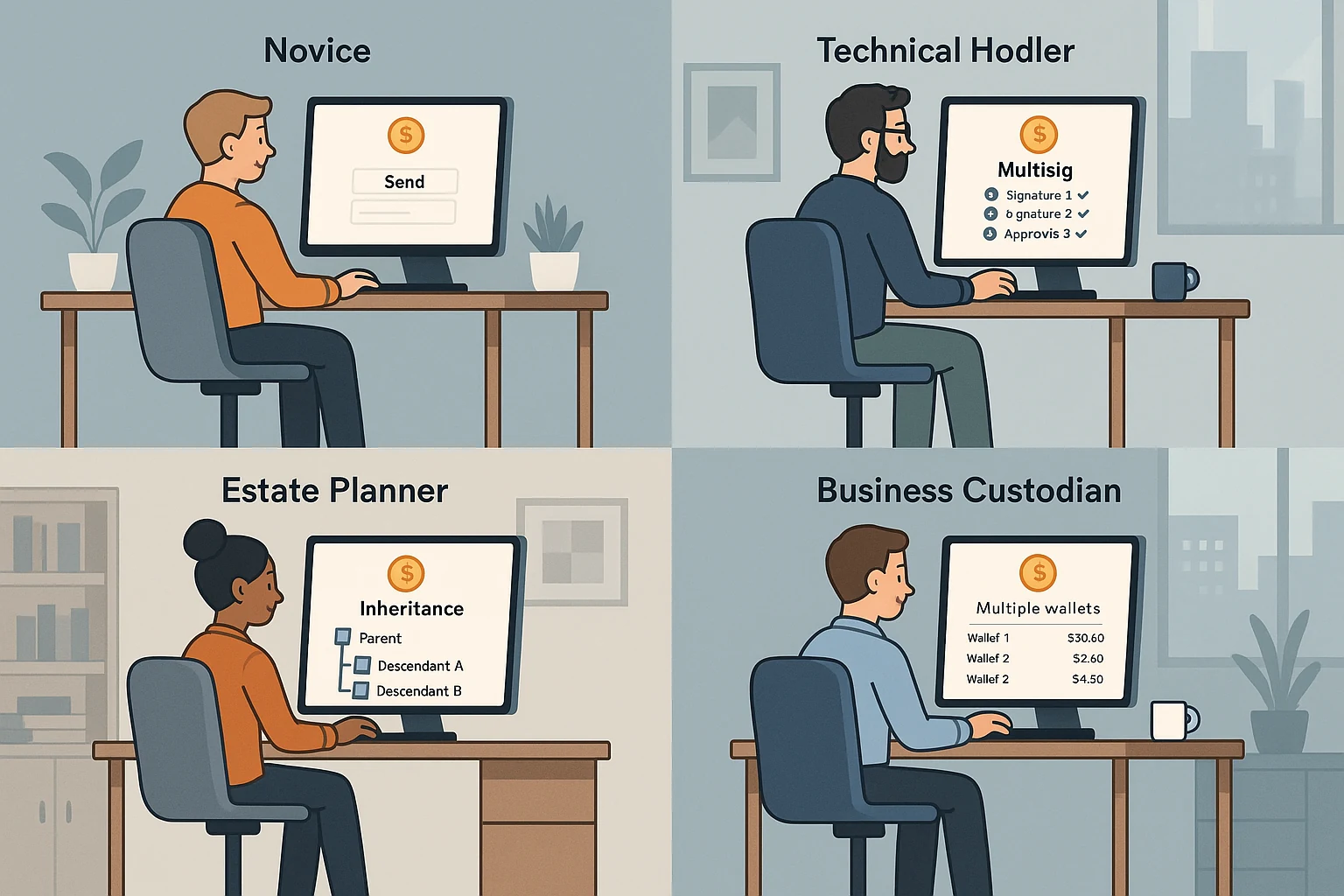
Who Uses a Desktop Wallet?
I split users two ways: by how much wallet experience they
have, and by how they use Bitcoin.
Keeper mobile users trying desktop, likely the largest group
People who used other mobile wallets like BlueWallet or Green
Power users coming from Sparrow or Specter
Complete beginners, likely a small share
By behavior: inheritance planners,
families sharing custody, hardware wallet users and cross device users.
Who I Designed For
Three personas cover the range, from someone scared of seed phrases to
someone who reads Bitcoin mailing lists.
The Cautious Wealth Preserver
Arvind Mehta, 52
Retired business owner with 3 BTC and low tech comfort. Fears losing access and wants
his son as a backup.
Needs: a guided 2 of 3 setup, simple words, and visual confirmations
like “You’re protected”.
The Secure Self Custodian
Arjun Singh, 32
Security researcher with 5+ years in Bitcoin. Runs Coldcard and Ledger in a 2 of 3
multisig.
Needs: a skip option, import of xpubs and config files, and clear key
health.
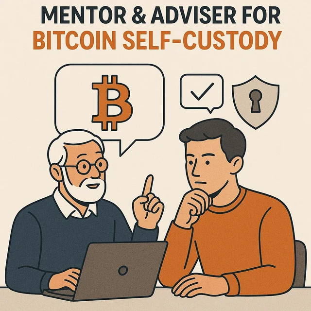
The Trusted Bitcoin Guide
Alex
Added after review. Mentors beginners and high net worth clients through self
custody.
Needs: guided shared setups and inheritance plans clients can’t get
wrong.
Anti persona: Ramesh, a
passive exchange holder with small savings on WazirX. He avoids self custody and would drop off
during onboarding, so I didn’t design for him.
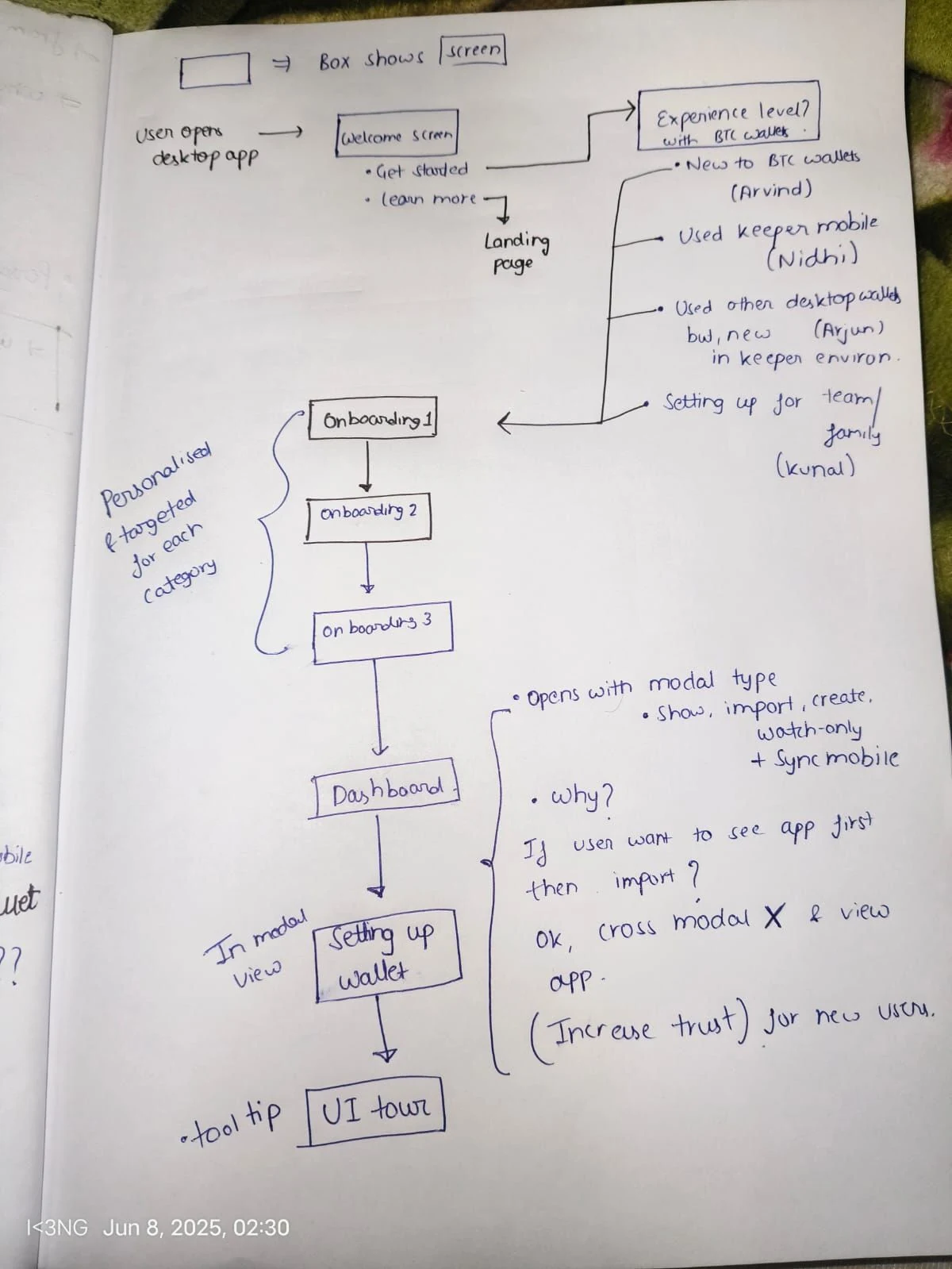
My First Idea: Onboarding That Adapts to You
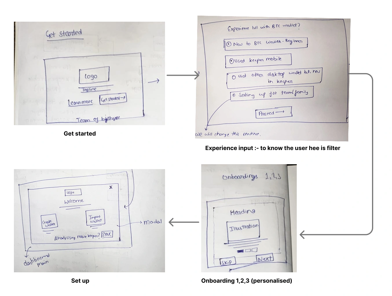
Ask about experience right after Get Started, then show each group its
own three screens.
First flow sketchWireframes with an experience picker
I wrote copy for four user types. For a
beginner like Arvind: “Your vault needs only 2 of 3 keys to recover funds. Even if one
device is lost, you’re safe.” For Arjun, the pitch was the control of Sparrow without
the clutter.
Why We Dropped It
In review, the team pushed back. A picker on the second screen
adds cognitive load and slows time to value.
The new direction: ship a simple mobile to desktop flow first,
then layer features on top. Don’t sell yet. Just make it easy to
use.
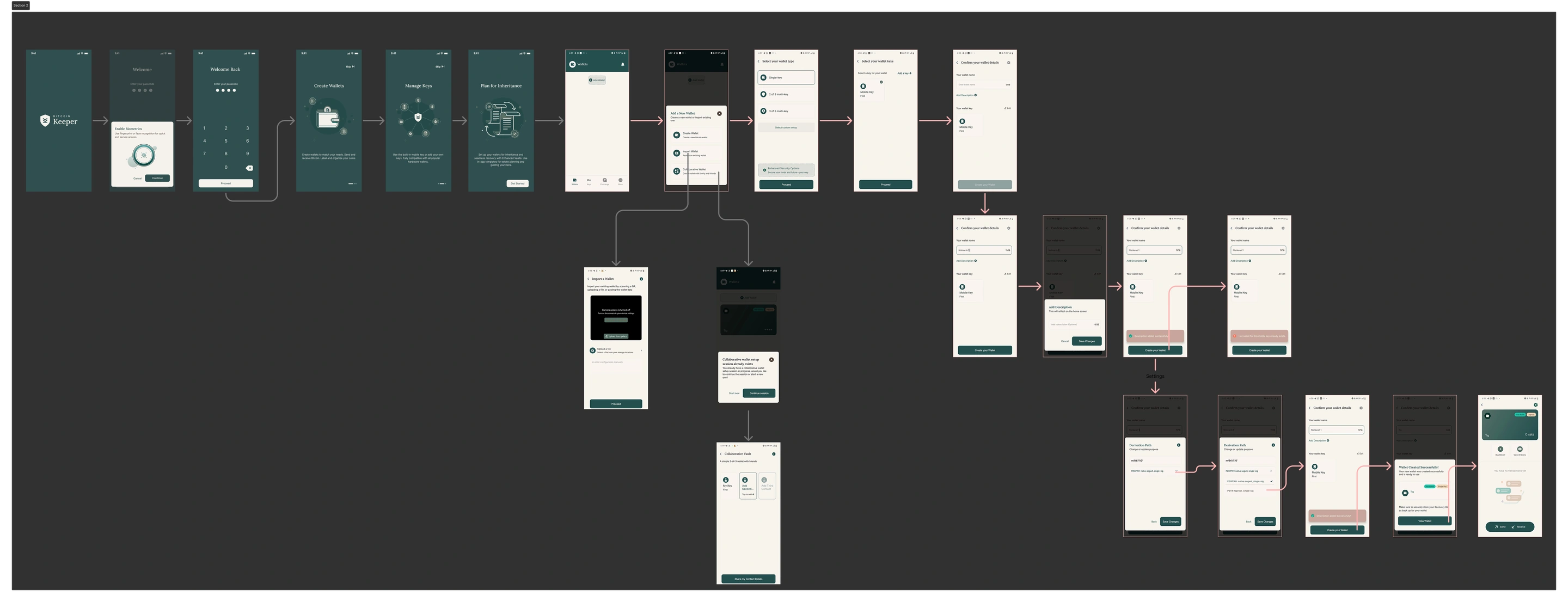
So I downloaded the Keeper app and mapped its
whole mobile onboarding in Figma, to reuse what users already know.
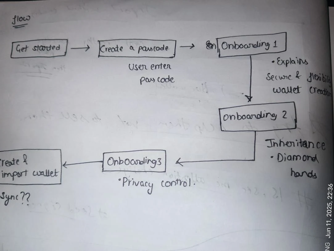
Then I sketched a leaner desktop flow: Get Started, passcode,
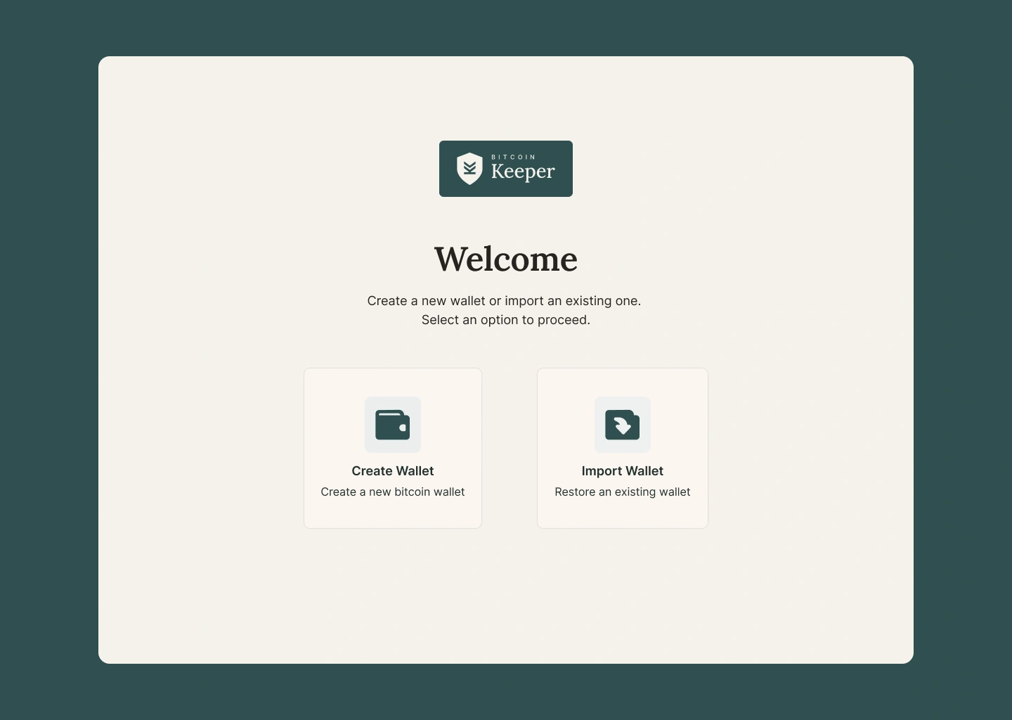
three intro screens, then create or import a wallet.
Setting the UI Foundation
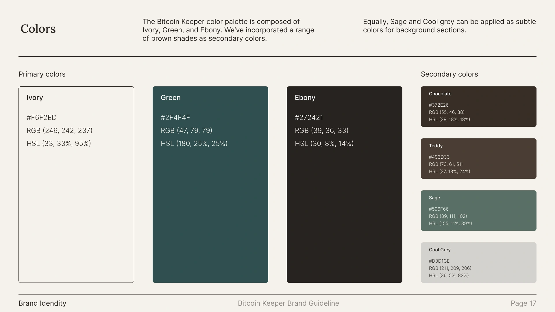
Keeper’s brand had three core colors: Ivory, Green and Ebony. I expanded
them into full shade ranges for states, contrast, and a future dark mode.
Colors as Figma variables, not styles, so light and dark modes
and global changes come for free.
An 8px spacing scale, easy for developers to map to rem.
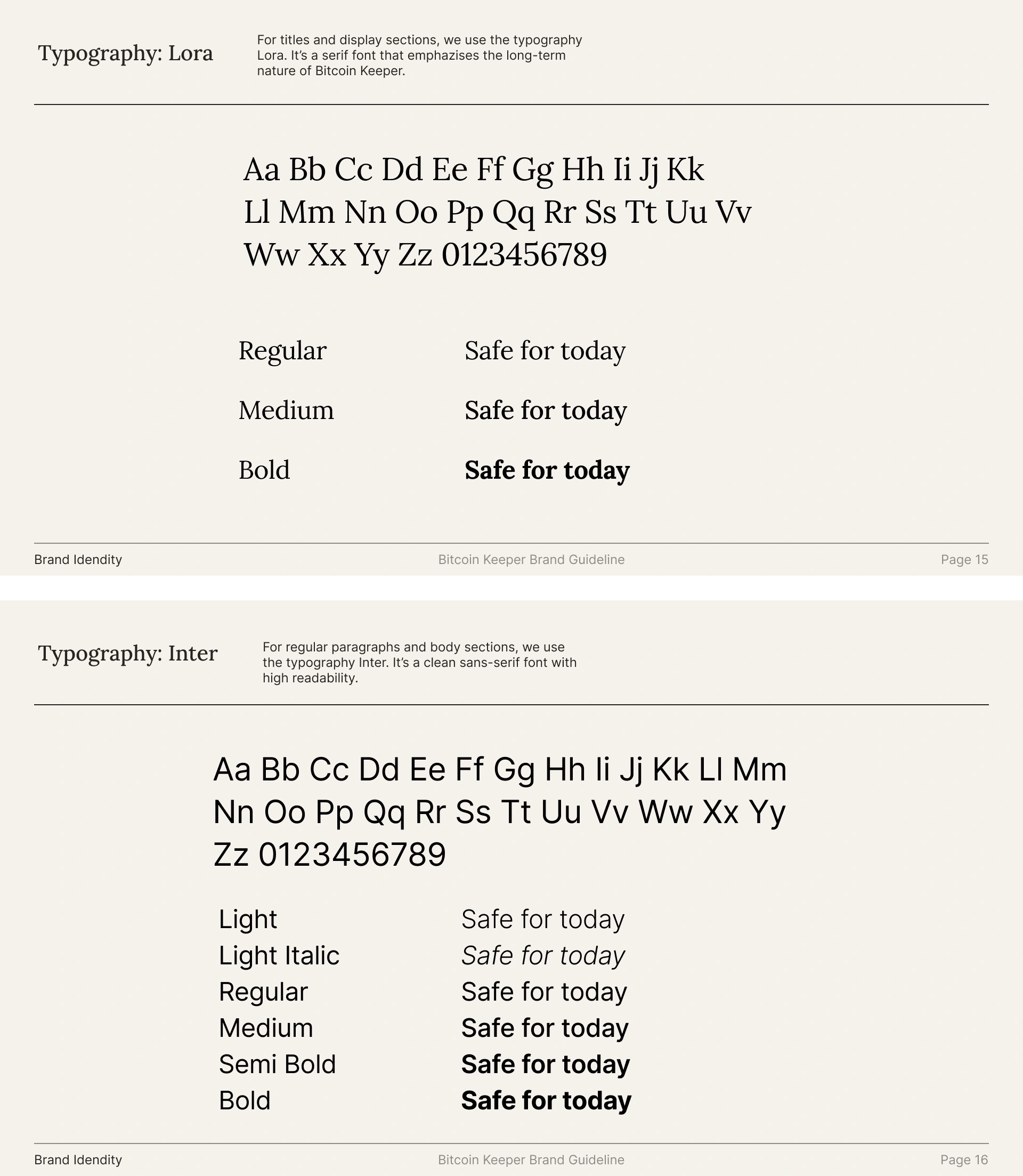
Lora for headings to feel premium, Inter for
body to stay readable.
Fixing the First Screen
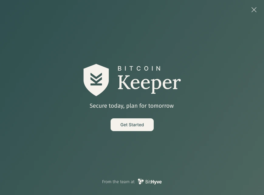
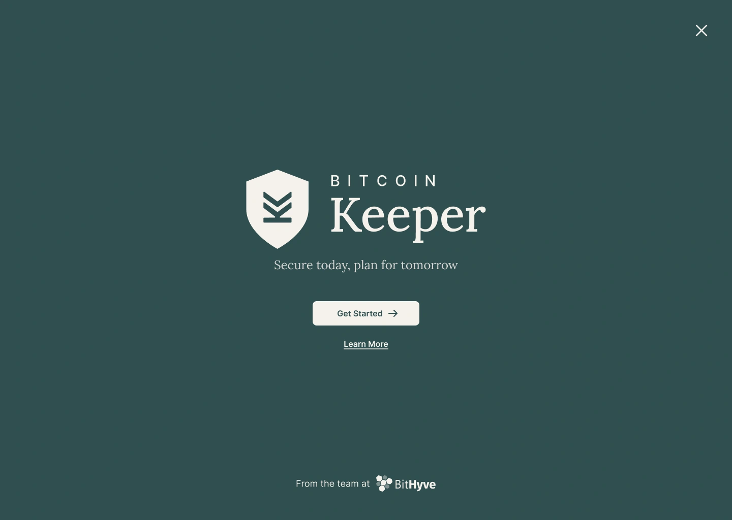
The old Get Started screen wasn’t on a standard 1440px desktop frame, and
its gradient and thin “From the team at” text failed WCAG contrast checks.
BeforeAfter
Should there be a Learn More button? No. A
second button competes with Get Started and slows activation. I kept it as a small link
to the help center, so cautious users can check they have the official app.
Trying AI Tools for UI
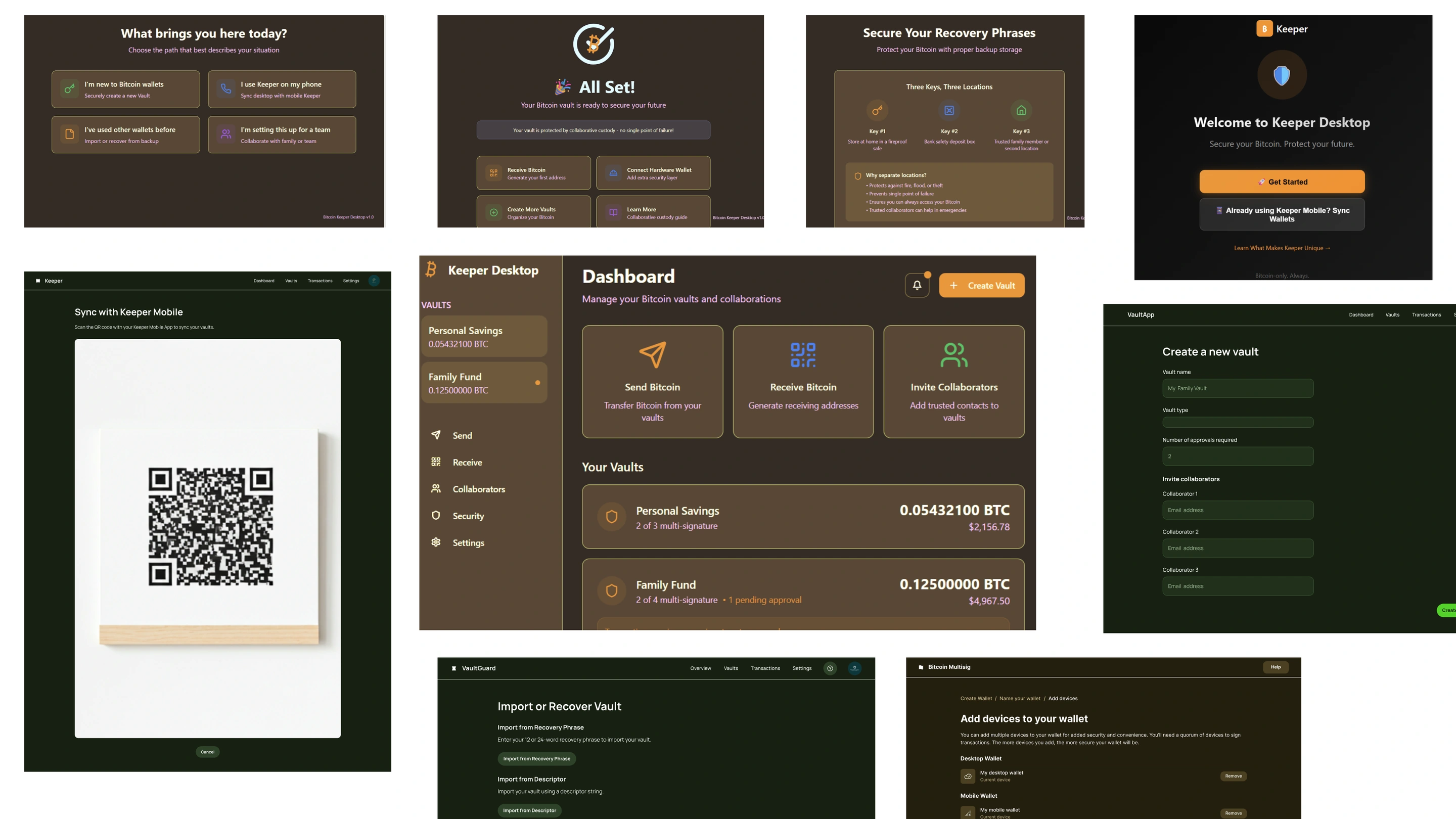
I tested Google Stitch and Lovable to speed up screen design. Neither got
the layout right, let alone the colors, so I designed the screens myself in Figma.
AI generated attempts
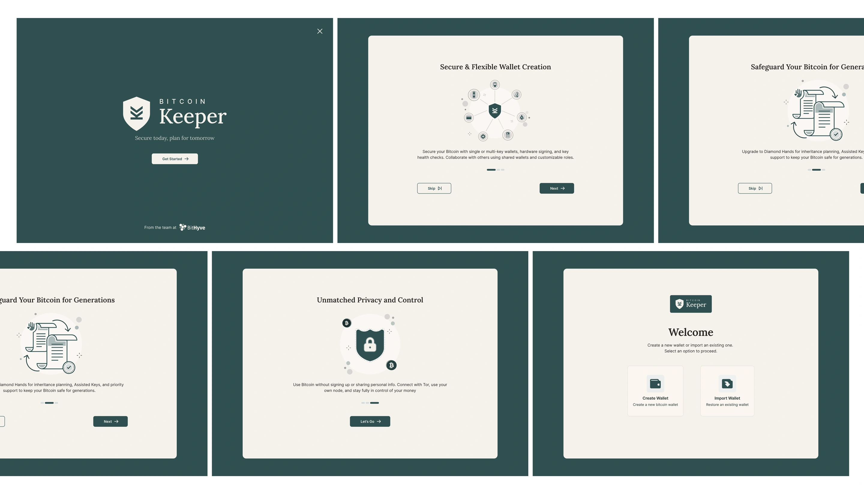
Final Onboarding Screens
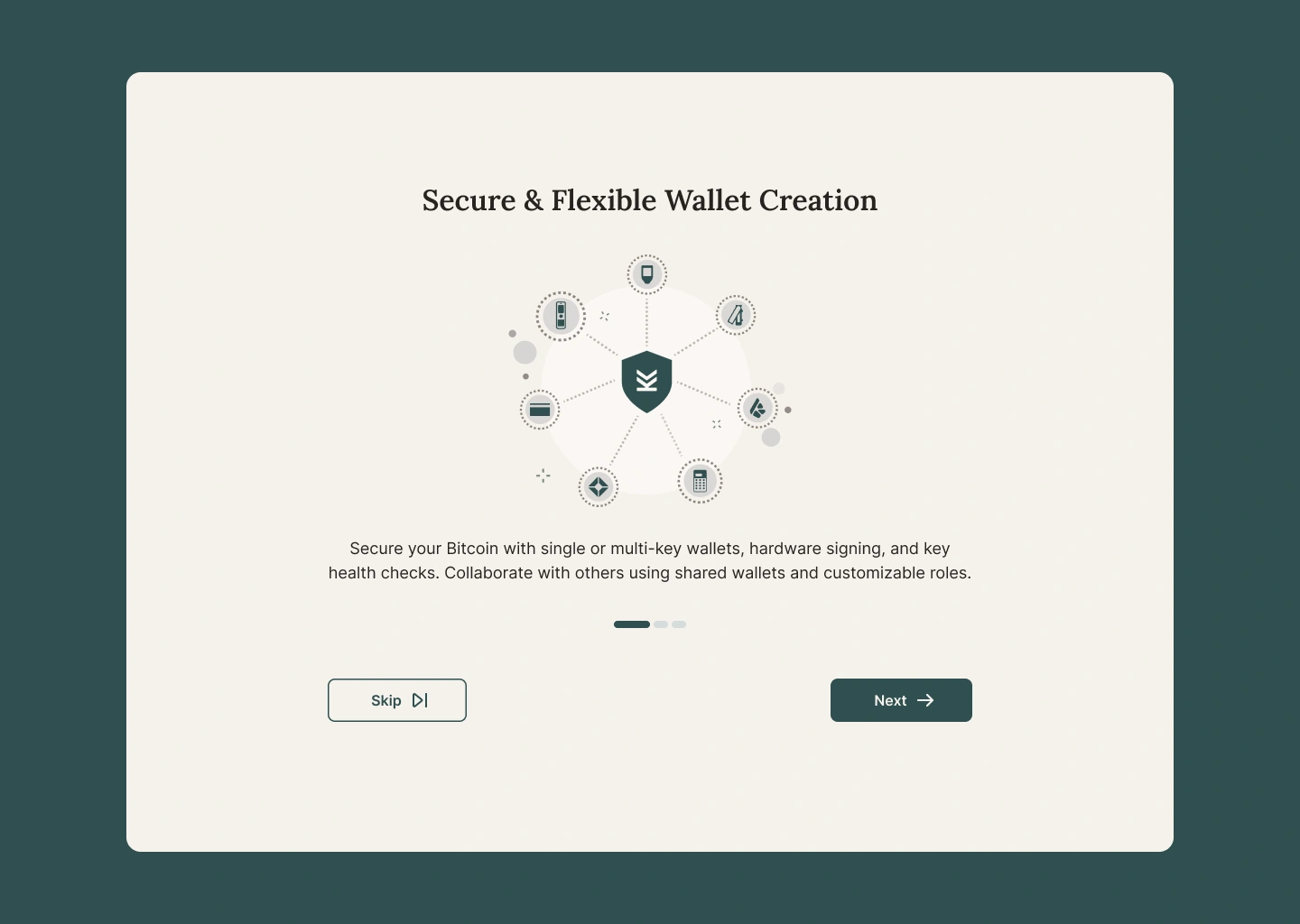
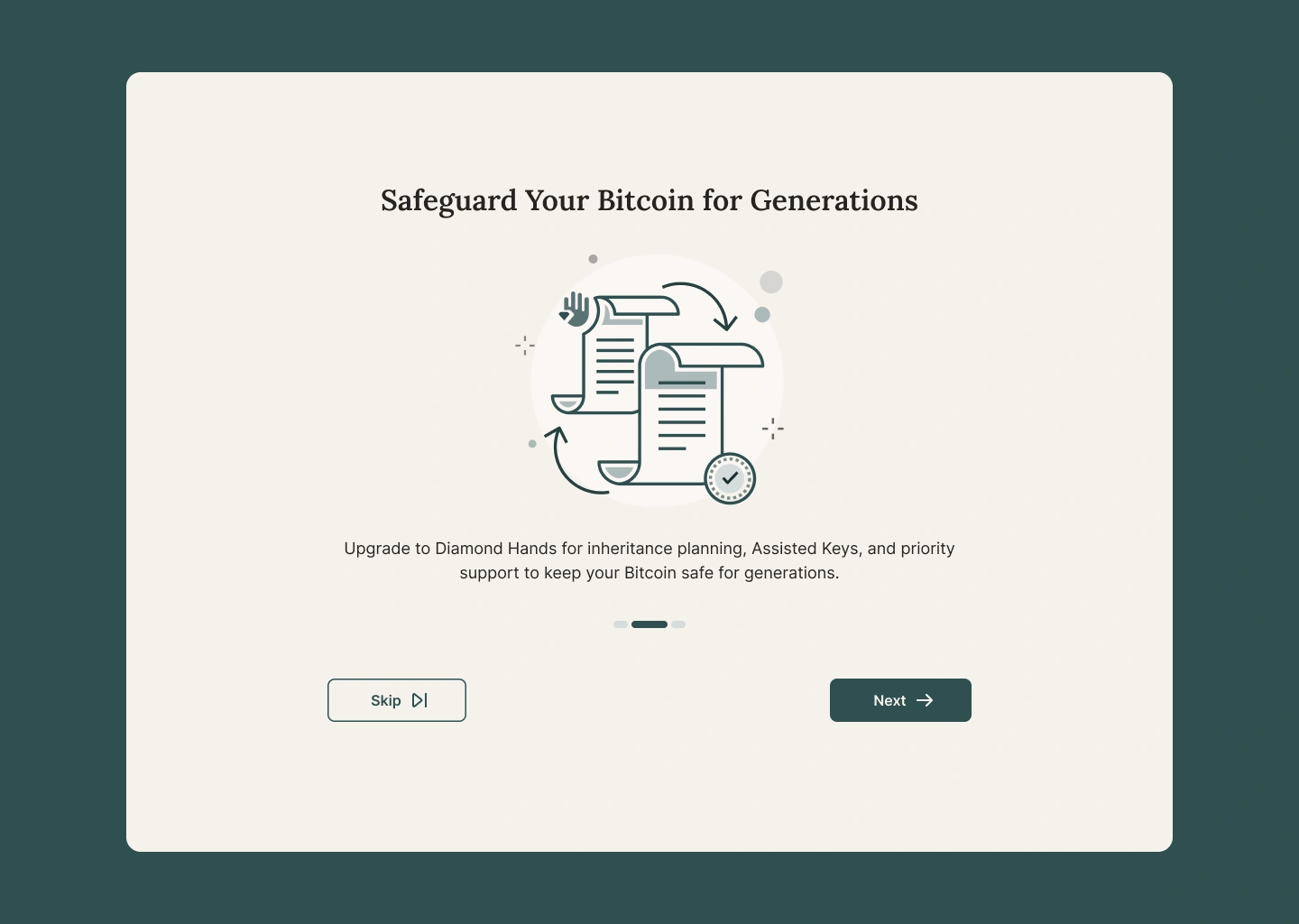
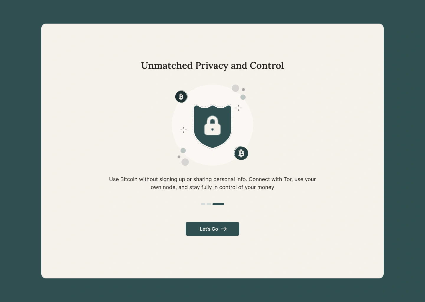
Three intro screens, in a deliberate order: security
first because every persona cares about it, inheritance second to build
emotional trust, and privacy last so users start out feeling in control.
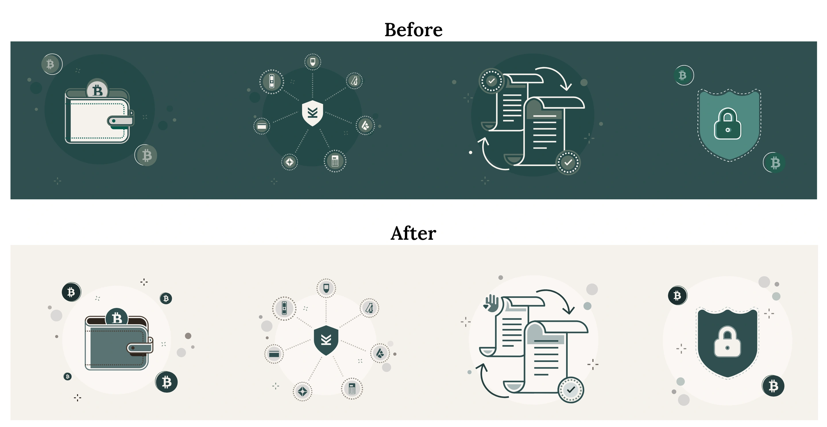
Illustrations reworked for light mode, on an Ivory surface for better
contrast
1. Secure & flexible wallet creation2. Safeguard your Bitcoin for generations3. Unmatched privacy and controlCreate or import a wallet
What’s Next
Passcode screens and their error cases, plus every state for
buttons, cards and inputs.
One open question: people often forget a
passcode set in the first minute. Should it move to after wallet creation?
What I Learned
Proving why something should exist comes before designing how it looks.
A good idea can still lose to time to value. Personalized onboarding was right for later,
not for V1.
Words are UI. Swapping “cosigner” and “xpub” for “Guardian” and “Heir” matters as much as
any visual.
Further reading
Want the raw research? It all lives in one Notion file.